
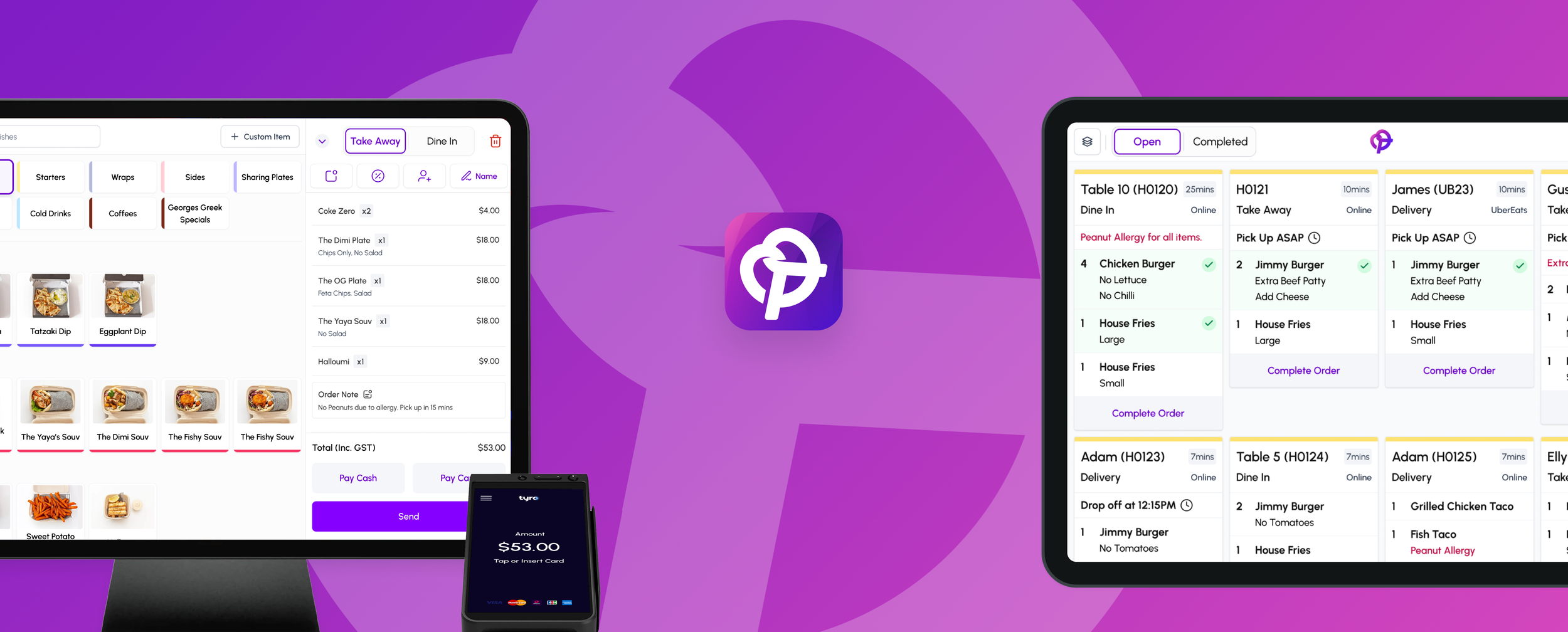
Designing an Efficient Kitchen Display System (KDS)
Project Type:
New Tablet Applications
Industry:
Start up - Hospitality
Team Members:
Founders
ReactNative Devs
React Devs
My Role:
Senior Product Designer
1. Context & Problem
About Pretzel
Pretzel (previously named Swifti) began as a lean tech start-up focused on online ordering for food trucks. As demand grew, it evolved into a full POS system for restaurants, cafés, and breweries, integrating in-person ordering, kitchen management, and payments into a seamless solution.
This case study hightlights Pretzel's Kitchen Display System (KDS) - 3 iterations and its impact on kitchen efficiency, demonstrating a 25% to 33% increase in speed to complete order completion time.
Design Thinking Approach
As Pretzel grew rapidly and onboarded new customers, we received a high volume of feature requests and feedback. To effectively tackle this, I advocated for a design thinking approach, focusing on quick, iterative releases that delivered immediate value. By launching small but impactful improvements, we could learn from real-world usage, validate assumptions, and refine features based on customer needs, ensuring each iteration moved us closer to an optimal solution.
v1 of KDS (MVP) Released in Feb 2024
v1.5 of KDS (Fast follow) Released in March 2024
v2 (Major Feature Updates) Released in May 2024
v3 Major Enhancement Dec 2024

What is a KDS?
A Kitchen Display System (KDS) replaces paper dockets with a digital workflow, improving speed and accuracy in busy kitchens. I designed and helped build the KDS for Pretzel POS, iterating from a simple MVP to a feature-rich solution that enhanced kitchen efficiency.
A KDS can be used as an alternative to, or alongside, traditional kitchen dockets, providing greater visibility, organisation, and efficiency in food preparation.
The Challenge
Busy kitchens need a seamless way to track incoming orders, prioritise preparation, and communicate order status efficiently. Traditional paper dockets often lead to:
Lost or misread orders
Lack of visibility on what’s in progress
Slower service times and miscommunication between kitchen and front-of-house
2. Research & Insights
Methods
Interviews: Engaged with chefs and staff to understand pain points.
Observational Research: Observed kitchen workflows and challenges with paper dockets.
Competitor Analysis: Evaluated existing KDS solutions to identify gaps in simplicity and efficiency.


Key Findings:
Frustration with lost/misread paper dockets and difficulty tracking open orders.
Staff manually crossed out completed items, struggling to manage multiple tickets.
Existing KDS solutions lacked simplicity and efficiency.
Key Insight:
A digital KDS should reduce cognitive load, enable real-time tracking, and be touch-friendly for fast, frictionless interactions.
Hypothesis / Problem Statement
Based on the research, we believe that switching from paper dockets to a digital Kitchen Display System (KDS) will:
✅ Reduce lost and misread orders
✅ Improve visibility of open orders, especially during peak hours
✅ Minimise errors caused by duplicate dockets and overlooked modifications
✅ Help kitchen staff track what’s ready vs. what’s still being prepared
By implementing an MVP KDS with a simple open order view, we can validate whether a digital system improves order tracking, reduces errors, and streamlines kitchen operations.
3. Design Process
Approach: Employed a design thinking methodology focusing on quick, iterative releases to deliver immediate value and refine features based on real-world usage.


Solution
Stick to exisiting Order flow contraints used by online ordering and POS Orders.
Displayed all active orders as digital dockets
Orders to be removed from the screen when completed
Large, clear typography for readability in a fast-paced kitchen
Clear Call To Action (CTA) to Complete or Progress Order
No customisation of how many dockets to display per row, going with 4 and a left to right approach as that is the default setting based on competitor analysis conducted.


4 Week Closed Beta
We had a Beta phase with 4 of our existing customers over a four-week period:
2 Food truck customers started using it.
2 cafe customers
✅ The data showed that the order completion times has a average 25% reduction meaning they are now pushing out orders 25% faster than before.
| Venue | Avg. Completion Time
(Before KDS) |
Avg. Completion Time (After KDS) |
Improvement |
|---|---|---|---|
| Food Truck A | 12 min | 9 min | 25% |
| Food Truck B | 15 min | 11 min | 26.7% |
| Cafe A | 20 min | 15 min | 25% |
| Cafe B | 18 min | 13.5 min | 25% |
Full Release for v1 - March 2024
✅ After the first month, 6 additional businesses (existing) adopted it—3 of them were food trucks that immediately stopped using printers.
✅ Those business also benefited from the improvement of a 25% reduction in Order Completion Time.
✅ Faster order tracking and fewer lost/missed orders.
⚠️ Kitchens wanted more granularity—some dishes take longer than others, and staff needed to mark items individually rather than completing entire dockets at once.
⚠️ A larger venue customer requested item routing as a feature (e.g., drinks go to the drinks station, food goes to the kitchen).
⚠️ We received a lot of feedback about the need to quickly re-open orders that were accidentally closed.
We did a quick fast follow v1.5 iteration at about the 6 week mark to address the feedback about quickly re-opening orders.

Iterations (v2) Based on Feedback - May 2024:
Marking Individual Items as Done & Item Routing:
Allowed staff to mark individual items as completed.
Introduced configurable kitchen routing rules, displaying relevant items at specific prep stations.

Results after releasing the second iteration
✅ Kitchens could now track partially completed orders
✅ Reduced miscommunication—front-of-house knew which items were ready
✅ Improved kitchen efficiency by allowing chefs to focus on remaining items
✅ Kitchens received only relevant items at each prep station, improving workflow.
✅ Reduced bottlenecks by eliminating the need for manual docket sorting.
✅ Improved coordination across teams, leading to faster and more accurate order completion.
⚠️ However, kitchens still faced a challenge—during peak hours, they needed a fast way to view upcoming items, allowing them to prioritise and streamline preparation.
Iterations (v3) Based on Feedback - Dec 2024:
This is the last Iteration covered in this case study.
We were lucky to have a handful of vocal customers which meant they were quiet engaged, our sales person also feed us feedback from potential leads regularly.
We were able to organise some interviews with some of our customers.


Summary of the interview
The most frustrating experience for chefs during busy times is preparing three of the same item—because that’s all they can see without scrolling—only to realise as they finish that another three or four were further down the list, unnoticed.
Competitor Analysis for grouping items.
This revealed that most KDS solutions in Australia lacked an aggregated Item / summary view, focusing instead on individual order dockets. However, international examples showcased more advanced grouping techniques, such as categorising items (e.g., all burgers or coffees together) and breaking them down to the modifier level (e.g., burger with extra cheese vs. no pickles).
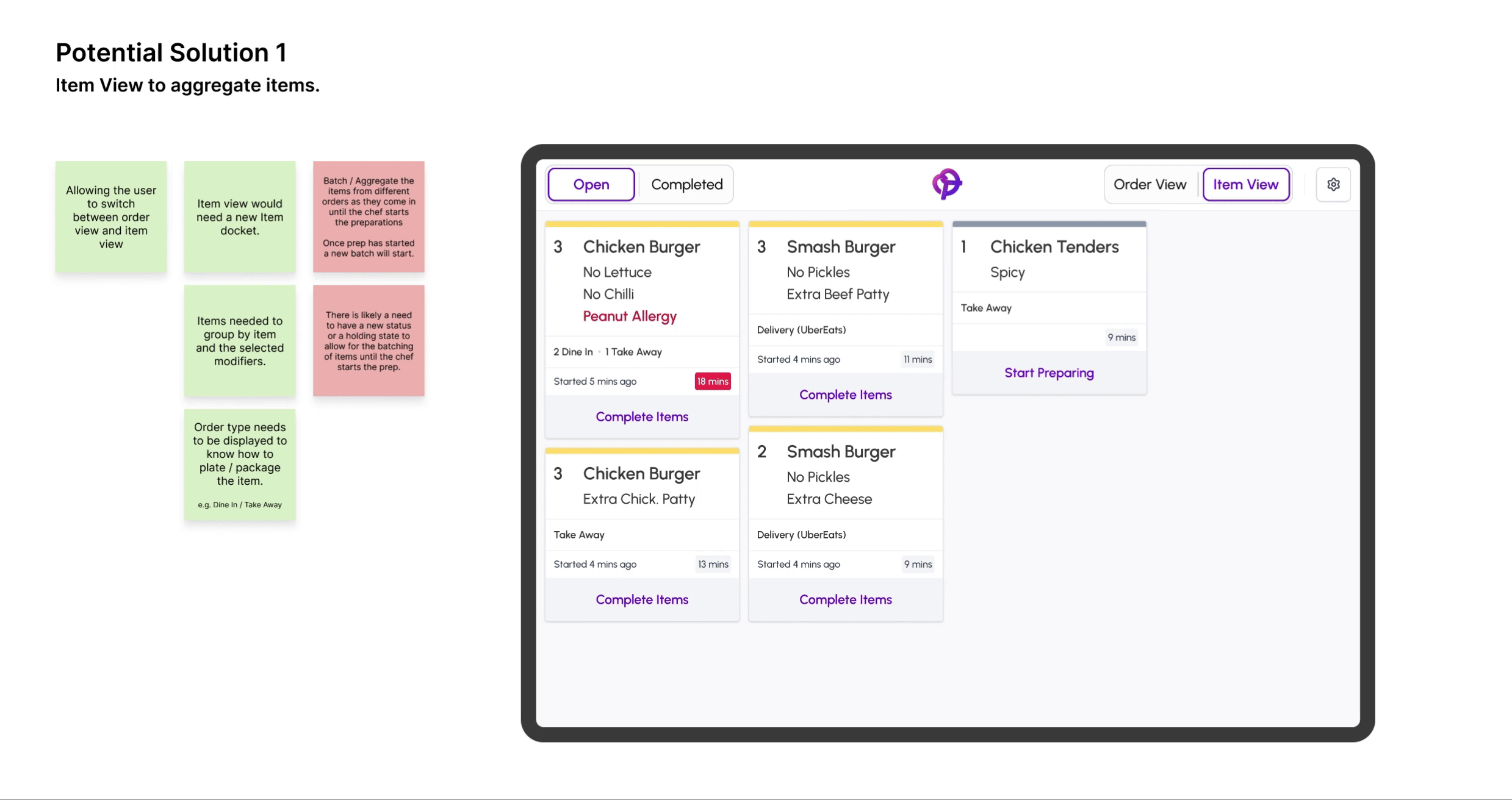
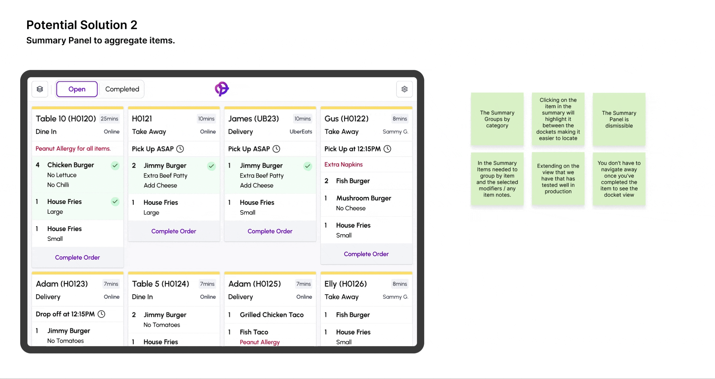
Why We Built the Summary Panel
The Summary Panel and Item View could actually be two separate features, each addressing different aspects of kitchen workflow inefficiencies. However, given time constraints and technical limitations, we prioritised the Summary Panel as the first solution.
Faster Implementation → The Summary Panel was built on top of the existing KDS layout, leveraging the current system without requiring major structural changes. In contrast, the Item View introduced a new UX paradigm that needed more testing to ensure usability.
Technical Constraints → The Item View required the creation of new order statuses to support batching, which conflicted with early technical decisions to avoid additional complexity in the order state logic.
Quicker Validation → With limited time for thorough user testing, we opted for a practical approach. I conducted a quick video call with one of our vocal customers, who tested both prototypes. Their feedback reinforced that the Summary Panel provided immediate value by solving the most pressing issue—allowing chefs to see aggregated totals without excessive scrolling.
By shipping the Summary Panel first, we were able to quickly alleviate kitchen frustrations while keeping the Item View as a potential future iteration that could be refined through further user research and testing.
Results After Implementing the v3 Iteration
✅ Improved Visibility – Chefs could now see total item counts at a glance, reducing the risk of missing duplicate orders further down the queue.
✅ Faster Prep Times – Eliminated unnecessary scrolling, allowing kitchens to work more efficiently, especially during peak hours.
✅ Reduced Errors – Ensured better batch preparation by grouping items, minimising inconsistencies in large orders.
✅ Positive Feedback – Customers found the panel intuitive and immediately useful, validating its impact with minimal need for training.
⚠️ Future Considerations – While effective, the panel was a stepping stone; deeper item-level tracking and batching may still be needed in future iterations.
| Venue | Avg. Completion Time (Before KDS) |
Avg. Completion Time (KDS - Iteration 1) |
Improvement (Iteration 1) |
Avg. Completion Time (KDS - Iteration 3) |
Improvement (Iteration 3) |
|---|---|---|---|---|---|
| Food Truck A | 12 min | 9 min | 25% | 8 min | 33.3% |
| Food Truck B | 15 min | 11 min | 26.7% | 10 min | 33.3% |
| Cafe A | 20 min | 15 min | 25% | 13.5 min | 32.5% |
| Cafe B | 18 min | 13.5 min | 25% | 12 min | 33.3% |
Impact & Takeaways
Key Success Metrics
✅ 33% increase in speed to complete orders.
✅ 90% adoption across all food truck customers
✅ 100% adoption across brewery customers
✅ 55% adoption across cafés & restaurant customers
✅ Reduced order preparation times by streamlining kitchen workflows
✅ Minimised errors & miscommunication between kitchen and front-of-house
Lessons Learned
🔹 Starting with a simple solution and iterating based on user feedback led to significant improvements.
🔹 Balancing simplicity with functionality ensured the system remained intuitive while addressing complex kitchen workflows.
The above 2 lessons also resulted in the Summary Panel became a key differentiator, positioning Pretzel as a tailored solution for high-volume hospitality environments
Final Thoughts
Conclusion: The Pretzel POS KDS exemplifies human-centered design, demonstrating how iterative development and continuous user engagement can lead to impactful solutions in the hospitality industry.